Word - On
Colour - White
Technique - White Space
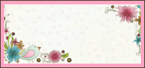
and I thought it was a great challenge and it is but wow was it hard for me!I always admire those layouts with lots of white space and minimal embellies, they look so striking. But I wanted to keep on adding .......... lol. I even added some colour - beige/light brown, so its still subtle. So enough waffling, here it is....

And some close ups, not many as the technique is white space.....lol


I have used a bit of this and a bit of that, some yummy new Prima, Collections butterflies, Prima stamps, Martha Stewart tags, Kaisercraft frame and doilie, ZVA Creative pearl swirl which I cut and finished it off with some hand stitching all the way around.
I am glad I persevered, thats what a challenge is about afterall? I am pretty happy with it now :)
Thank you for popping by and for your lovely comments!


OH! WOW! Colleen....
ReplyDeleteSimply DIVINE!!!!
The hand stitching around the edge VERY VERY NICE... Love it!!
The white space is GORGEOUS... I do white space well.... LOL!
Hope you have a WONDERFUL Weekend!!!! xx
I love it Colleen! You've done a fantastic job with the criteria. Very striking! :)
ReplyDelete